Responsive Website Design
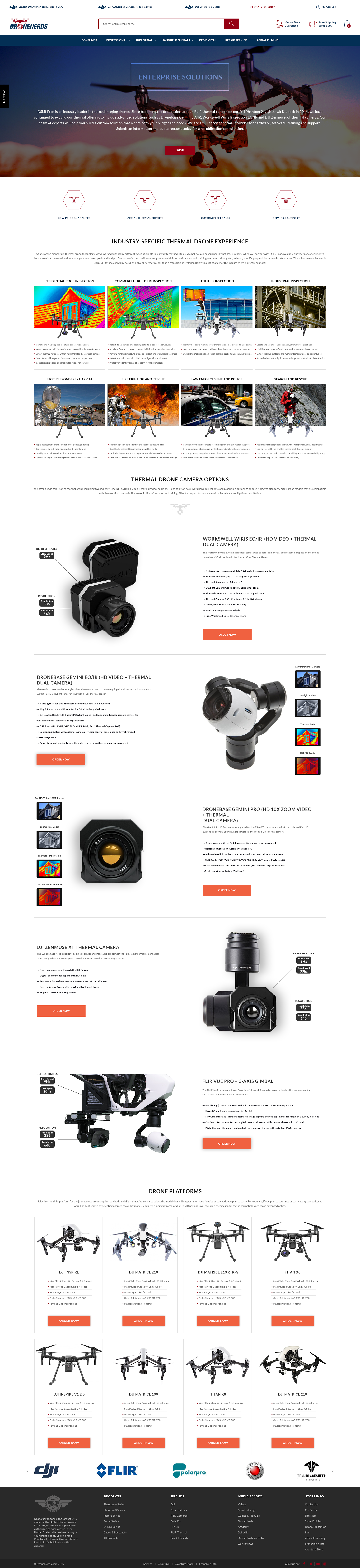
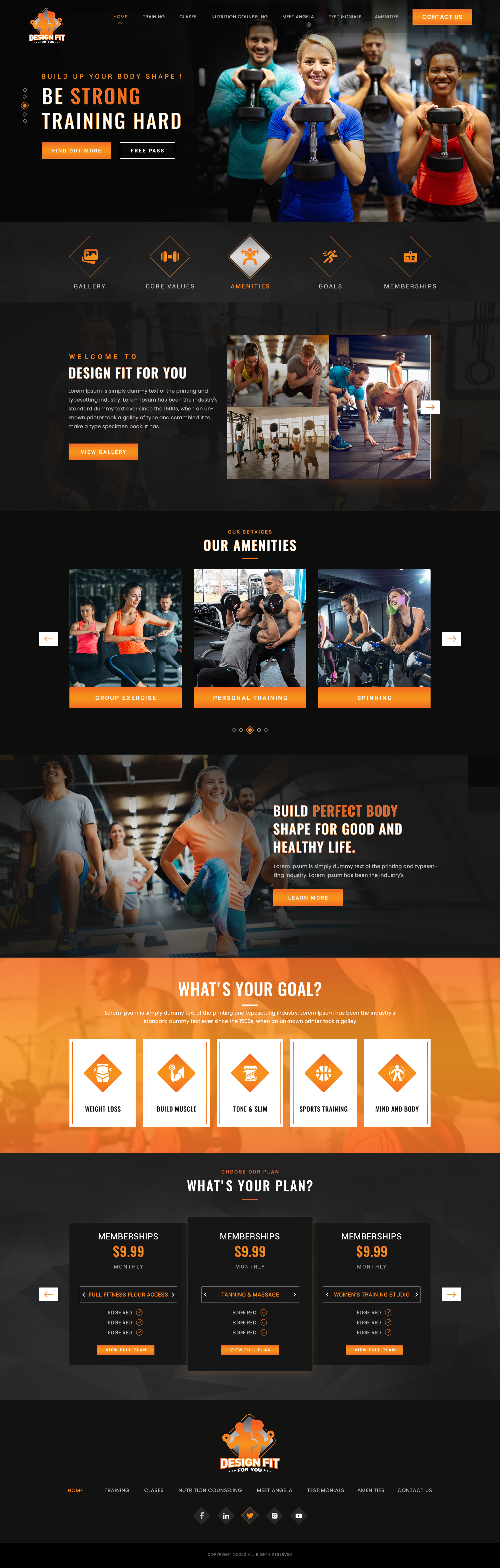
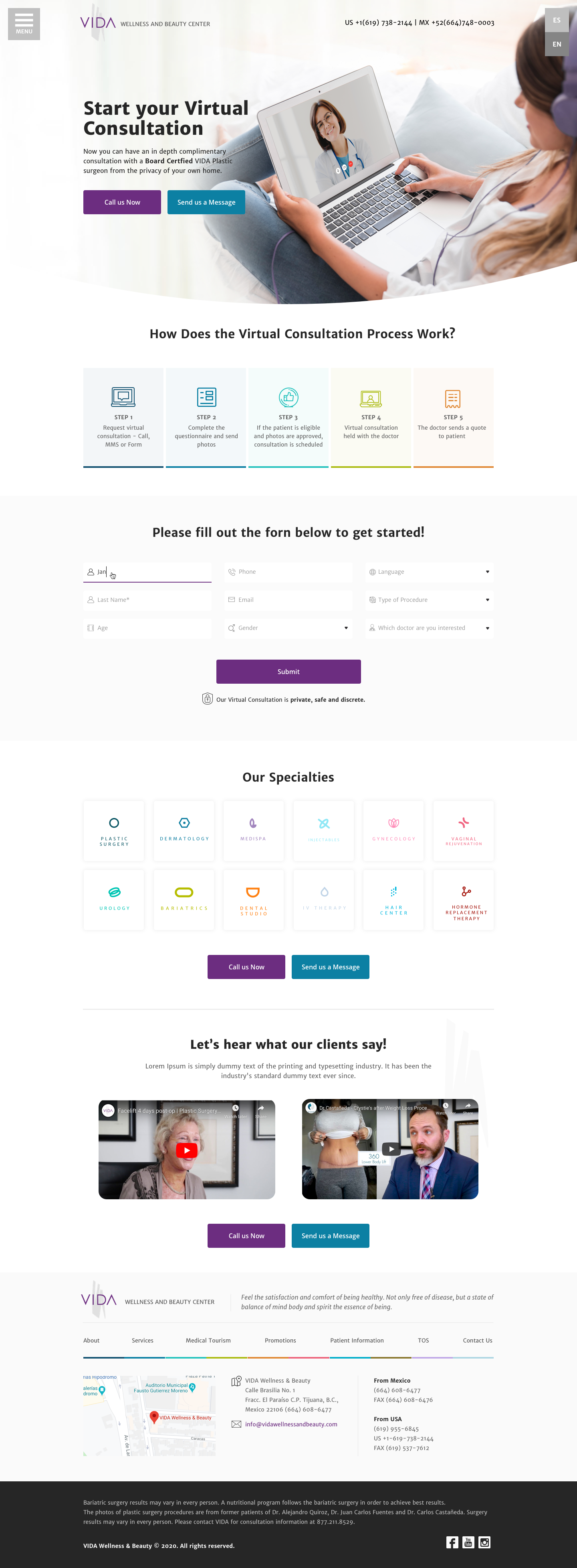
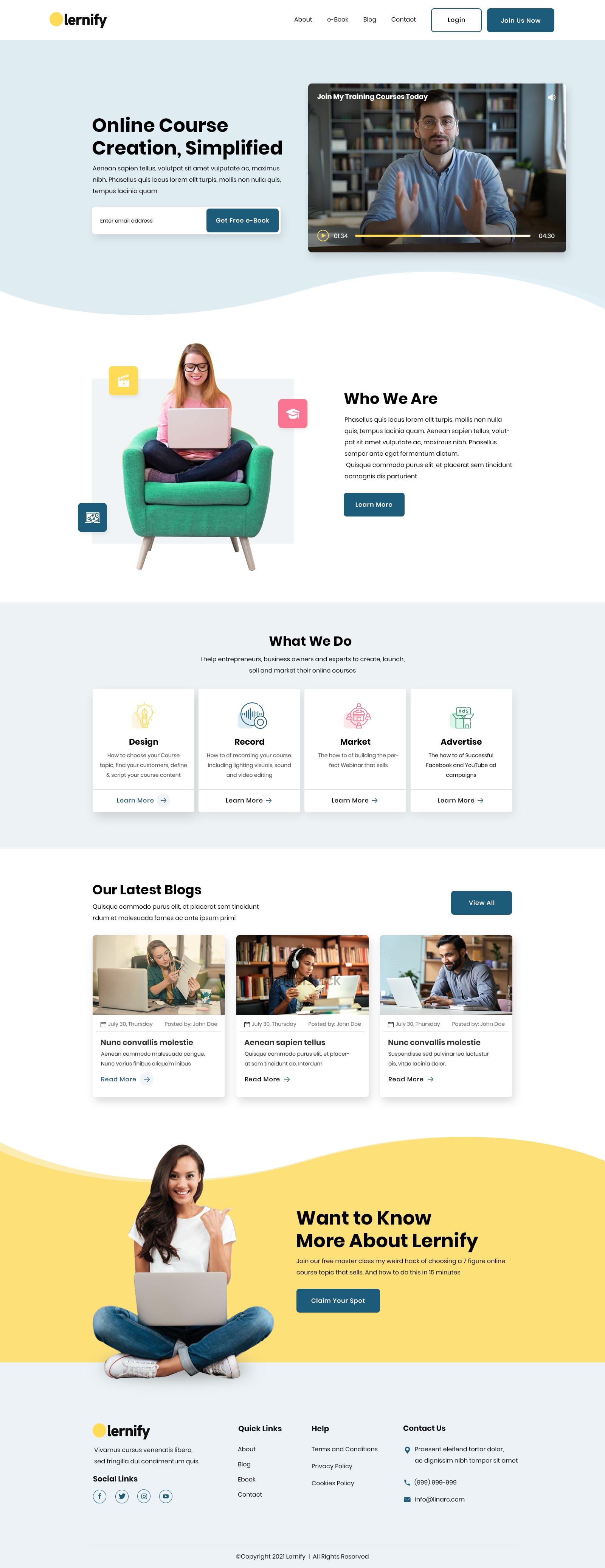
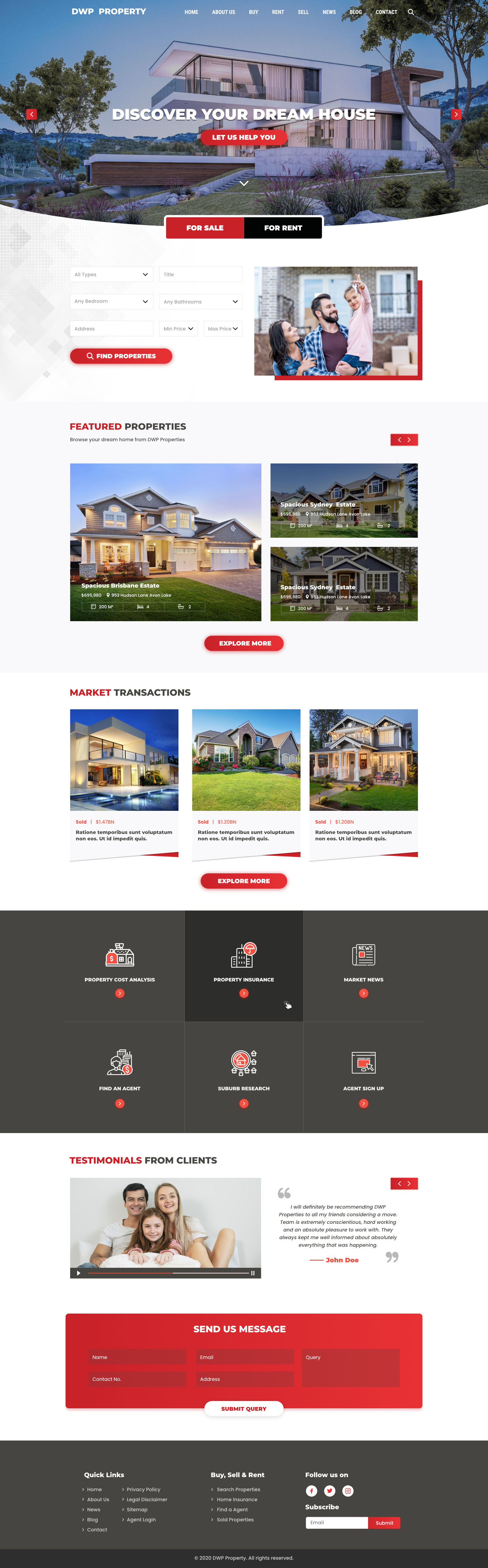
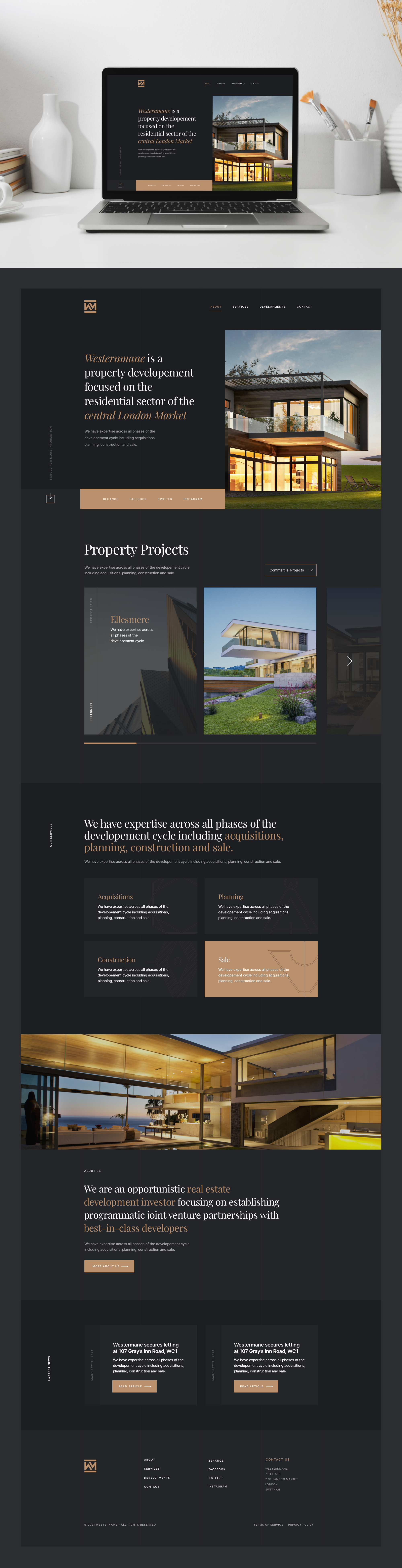
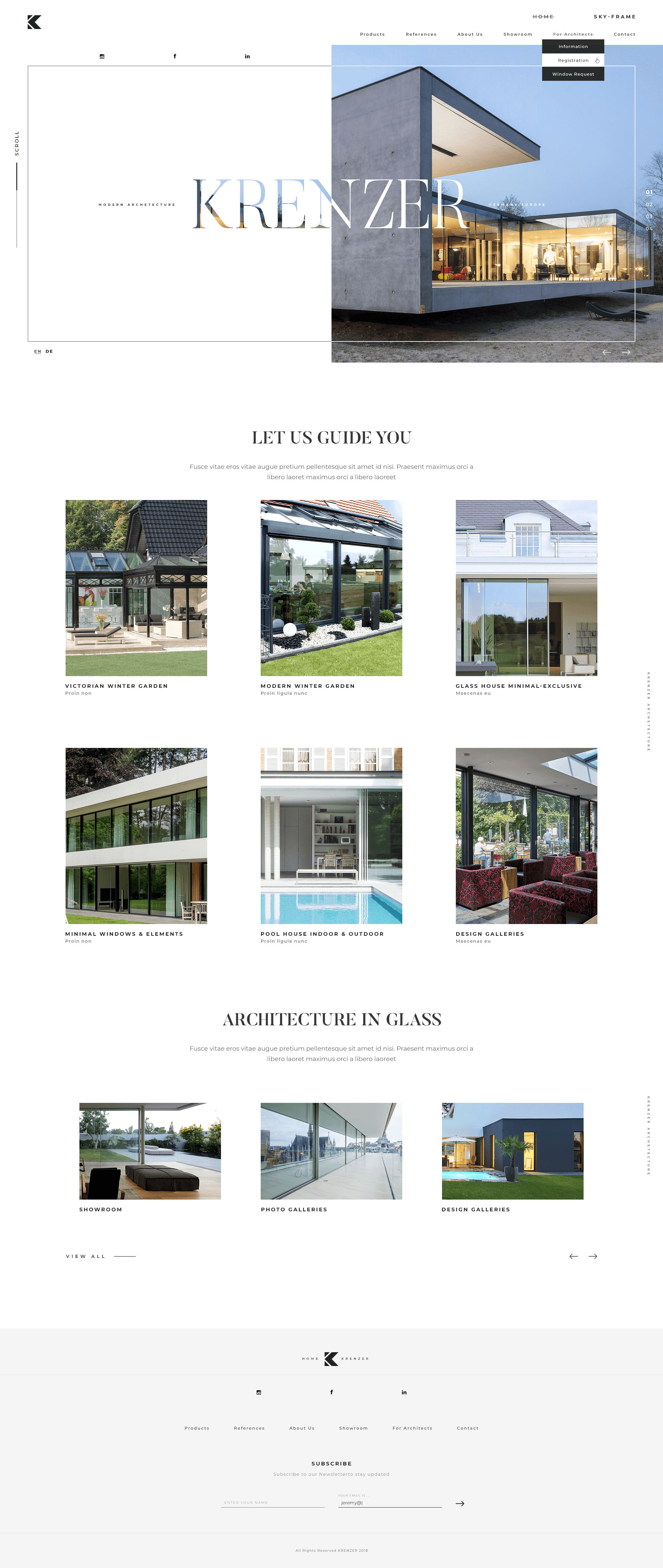
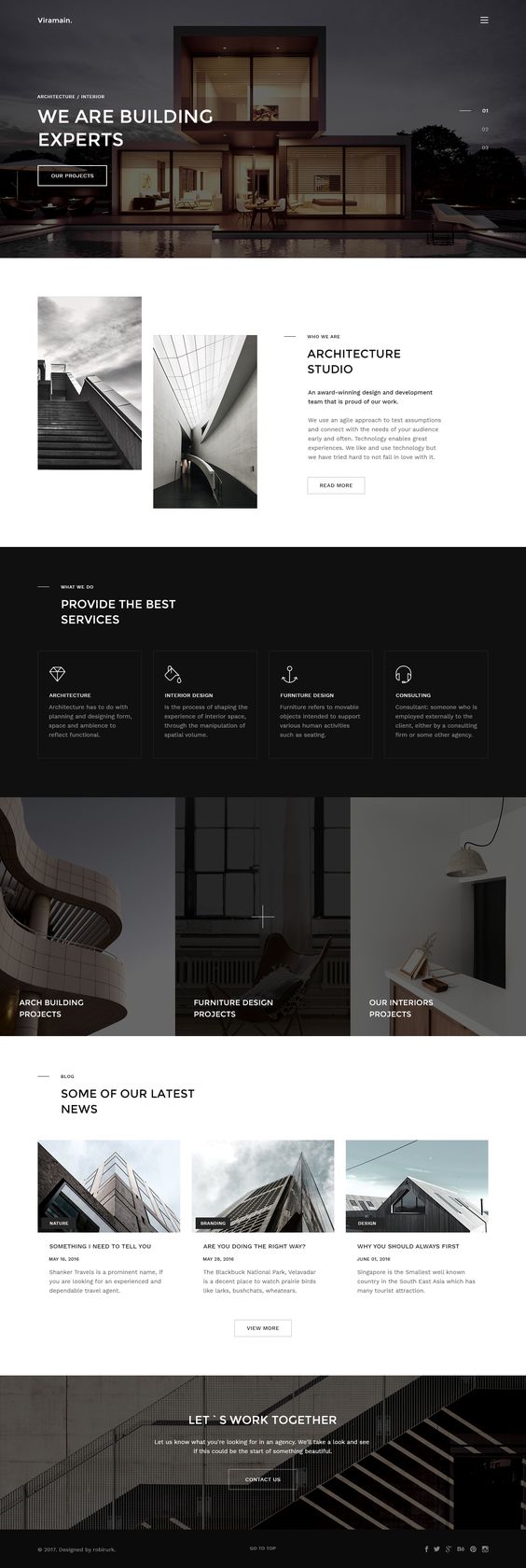
We excel at developing high quality responsive websites that are customized to your satisfaction. Ensuring uniqueness and a user-friendly experience for you and your audience is what we aim to provide. Our expert designers and developers will take your ideas and generate the best plan which will give you an unforgettable experience with Newyork Web Labs.
Our Renowned
History
We at Newyork Web Labs have been serving people for several years & have been excelling in our field by providing design-driven solutions & innovative brand ideas. We have effecti-vely helped & supported brands in arriving at their most eNewyork Web Labs potential and boost-ing their latent capacity. We are the best website design agency and we are situated in Richmond Hill, New York, USA. Our fulfilled customer base is a living confirmation of that reality.

Our Key Features
Design, Strategy, and Technology will help you stand out online.

High-Performance
Our talented developers and designers create websites that are eNewyork Web Labsly engaging. We ensure that your website stays a constant source of interest for potential consumers.

Unique Designs
Our web developers collaborate with you to design a website that is unique to you. We aim to help you achieve your goals and realize your vision.

Highly Responsive
Our site development is efficient enough to help you achieve your company objectives. We design a mobile-friendly website that can be seen on any device.

Value Towards Persistence
We, as a group, strive to go forward in an effective and efficient manner by persevering. We try to alleviate the burden of running a business off your shoulders.
We Aim At 100% Client Satisfaction
With years of experience in the markert, Newyork Web Labs design agency aims at fulfilling and satifying their clients, through hard work and strong communication, we go the extra mile to make sure you are delivered high standards we promise you.
















What Responsive Design Actually Requires
"Responsive" has become shorthand for "doesn't look broken on a phone." That's a low bar. Genuinely responsive design means the experience was considered at every screen size, not just stretched or squeezed to survive one.
Breakpoints are a starting point, not the whole job
Most responsive builds handle the three or four standard breakpoints — phone, tablet, desktop — correctly. Where they fall short is the space between: an awkward tablet width, a phone in landscape, a browser window resized to something in between. Testing at fixed breakpoints alone misses these; testing by actually dragging the browser width tends to catch them.
Touch and cursor are different interaction models
A menu that works well with a precise mouse cursor can be frustrating with an imprecise thumb. Tap targets need to be larger than click targets, hover-triggered menus need a tap-based equivalent, and anything relying on a mouseover state needs to work when there's no mouse at all.
Images and fonts need their own responsive treatment
A hero image sized for a widescreen desktop, served unscaled to a phone on cellular data, is one of the most common causes of slow mobile load times. Responsive images serve an appropriately sized file per device rather than shrinking a large one after the fact. Font sizes need the same consideration — text sized comfortably on desktop often becomes too small to read on a phone without an explicit mobile size.
Content order matters as much as layout
What appears first on a narrow screen should be what matters most to a visitor in a hurry, which is not always what appeared first in the desktop layout. Reordering content for mobile, not just resizing it, is what separates a genuinely responsive site from one that's merely flexible.
A practical responsive checklist
- Test on an actual phone on cellular data, not just a resized browser window
- Check tap target size on real touchscreens, not with a mouse cursor
- Confirm the most important content and call-to-action appear first on mobile
- Verify images are served at a size appropriate to the device, not just scaled by CSS
Responsive design done properly means every visitor gets a version of the site built for their screen, not a compromise that technically renders on all of them.
Responsive Website Design: One Site That Works on Every Screen
Responsive design means a single website rearranges itself to fit the screen it is viewed on, whether that is a phone, a tablet, a laptop or a wide desktop monitor. There is one set of content and one address for every page, so nothing has to be maintained twice.
Why it affects rankings, not just appearance
Google indexes the mobile version of a website first and uses it to judge the whole site. If content, links or structured data are missing or hard to use on a phone, rankings suffer on every device. A responsive build keeps mobile and desktop content identical, which removes that risk. Our guide to mobile-first web design covers this in more detail.
Responsive is more than shrinking the page
A site can technically resize and still be frustrating on a phone. We design for how people actually use each screen:
- Tap targets large enough for a thumb, with space between them, so visitors do not hit the wrong link.
- Readable text without zooming, and line lengths that stay comfortable on wide screens.
- Navigation that collapses cleanly on small screens without hiding the pages people need most.
- Forms that bring up the right keyboard for phone numbers and email addresses, and ask only for what you need.
- Click-to-call and maps placed where mobile visitors look for them.
Images and speed
Phones on mobile data are where slow pages hurt most. We serve images in modern formats and at the size each screen needs, rather than sending a desktop-sized photo to a phone, and lazy-load images further down the page. Layouts reserve space for images and embeds so content does not jump while loading. See website speed optimisation for why these details matter.
Accessibility comes with good responsive design
Readable type, strong contrast, keyboard navigation and layouts that survive browser zoom help visitors with disabilities and everyone else too. Our article on website accessibility explains the standards involved.
How we test
We test on real phones and tablets as well as browser tools, across iOS and Android and the major desktop browsers, at the widths in between as well as the common ones. Problems usually hide in those in-between sizes.
Already have a site that is not responsive?
It can often be rebuilt on a responsive layout while keeping your content and URLs, which protects existing search rankings. Our redesign checklist lists what to protect during that move.
Frequently Asked Questions
What is responsive web design?
Responsive web design means one website automatically adapts its layout to any screen, from phones to wide desktop monitors, with one set of content and one address for every page.
Does responsive design affect Google rankings?
Yes. Google indexes the mobile version of a site first, so content and usability on phones affect rankings on every device.
Can you make my existing website responsive?
Usually yes. We can rebuild it on a responsive layout while keeping your content and URLs, which protects existing search rankings.
How do you test responsive websites?
We test on real phones and tablets as well as browser tools, across iOS, Android and major desktop browsers, including in-between screen widths.
What Will Newyork Web Labs Cost You?
We have successful customized design solutions with affordable packages to meet your requirements.
-
Info Website Plans
Great for showcasing a professional website
-
eCommerce Website Plans
Essential for accepting online payment
-

50% Off $298
Essential Plan
Hassle Free Design
$199
Value Added Design Solution
Get Started3 Page Website
2 Stock Images
Contact/Query Form
Complete Deployment
Dedicated Account Manager
48 to 72 hours TAT
100% Satisfaction Guarantee
100% Unique Design Guarantee
100% Money Back Guarantee*
-
50% Off $298
Team Plan
Smart design Solution
$499
Value Added Design Solution
Get Started5-6 Unique Pages Website
5 Stock Photos
1 Banner Design
1 jQuery Slider Banner
Google Friendly Sitemap
Complete Deployment
W3C Certified HTML
Cross Browser Compatible
Dedicated Account Manager
48 to 72 hours TAT
100% Satisfaction Guarantee
100% Unique Design Guarantee
100% Money Back Guarantee*
-
50% Off $298
Corporate Plan
Cutting-edge Design Solution
$799
Value Added Design Solution
Get Started10 Unique Pages Website
CMS Integration
Custom WordPress Backend
8 Stock images
3 Slider Banner Design
1 jQuery Slider Banner
FREE Google Friendly Sitemap
Complete Deployment
W3C Certified HTML
Mobile Responsive
Cross Browser Compatible
Dedicated Account Manager
48 to 72 hours TAT
100% Satisfaction Guaranteed
100% Unique Design Guaranteed
100% Money Back Guarantee*
-
50% Off $298
STARTUP
Hassle Free Design
$799
Value Added Design Solution
Get StartedCustomized Design
Up-to 80 Products
Content Management System (CMS)
Mini Shopping Cart Integration
Payment Module Integration
Easy Product Search
Dedicated Designer & Developer
Unlimited Revisions
100% Satisfaction Guaranteed
100% Unique Design Guarantee
100% Money Back Guarantee
-
50% Off $298
Professional
Smart design Solution
$1299
Value Added Design Solution
Get StartedCustomized Design
Up-to 225 Products
Content Management System (CMS)
Full Shopping Cart Integration
Payment Module Integration
Easy Product Search
Product Reviews
Team of Expert Designers & Developers
Unlimited Revisions
100% Satisfaction Guarantee
100% Unique Design Guarantee
100% Money Back Guarantee
-
50% Off $298
Identity
Cutting-edge Design Solution
$1999
Value Added Design Solution
Get StartedCustom Dynamic Design & Development
Unlimited Products & Custom Category Sections
Unique, User Friendly, Interactive, Dynamic, High End UI Design
Unlimited Banner Designs
Interactive Sliding Banners
Special Hover Effects
Customized Contact us Form
Multiple Filtration Option (Search by Age, Experience, Talent, Industry etc)
Profile Comparison (As per Category)
File Converter
Custom Video Functionality
Multiple File format Uploading
User Signup & Login Area
User Dashboard Area
Custom Coding and Development
Content Management System (Custom)
Online Appointment/Scheduling integration (Optional)
Online Payment Integration (Stripe, PayPal, ApplePay, GooglePay)
Invoicing System
Custom Dynamic Forms
Complete Database Creation
Social Media Integration (Instagram, Facebook etc )
Signup Automated Email Authentication
Signup Area (For Newsletters, Offers etc.)
Search Bar for Easy Search
Search Engine Submission
SEO friendly
Mobile Responsive (All Screens)
Custom Admin Panel
SSL Certification (to make the website and it`s informative secured)
1 Year Cloud Support and Web Maintenance
Award Winning Team of Expert Designers and Developers
Complete Deployment
Complete W3C Validation
Dedicated Team of Designers and Developers
100% Satisfaction Guarantee
100% Unique Design Guarantee
Our Creative Designs Serve Over 200 Industries
With our top-notch ideas and designs, we have endeavored to serve clients from any industry.








Have A Look At What Our Clients Have
To Say About Us!

The feedback we get from our customers tells about our cooperation better than we do and makes us move forward.
-


Chris
Great Website Design
“Great Website design and communication services, What a great site have been created.”
Visit Chris’s Site -


Alyssa C.
WOW!
“I hired Newyork Web Labs for Custom animation videos and I just have to say WOW! Really impressive work guys. Keep it up. Newyork Web Labs definitely gets my recommendation.“
View More -

Jessica A.
Glad that I went for Newyork Web Labs!
“Glad that I went for Newyork Web Labs!! Thankyou Danny for your awesome work for my social media accounts. ❤“
View More -
Eric R.
Newyork Web Labs design really provides an…
“Newyork Web Labs design really provides an amazing experience. From website development to the after support every step of the project was fantastic. Overall experience working with Newyork Web Labs was great. I definitely recommend them to others.“
View More -
Anastasia Peter
THANKYOU Newyork Web Labs!!
“Fast, efficient and reliable!! That's all I have to say about Newyork Web Labs designs. More than perfect for back to back projects handling. I have more than 5 designing projects with Newyork Web Labs designs and working on them in parallel. Not a single issue in any of those.“
View More -
Isatou Senghore
My experience was very good they work…
“My experience was very good they work very fast and they fix everything what I needed. I like this company so much it’s one of the best company for web designing.
View More